

10 Reasons Why Mobile-Friendly Web Design Is Important for New York Businesses in 2026
📅 Updated on: September 13, 2026
New York is one of the most competitive business markets in the United States. Whether you run a small local business in Brooklyn, a professional service company in Manhattan, an eCommerce store in Queens, or a growing company serving customers across New York, your website plays an important role in how people discover and evaluate your business.
If you’re planning a new website or considering a redesign, understanding the investment involved is just as important as choosing the right design approach. Our detailed guide to website development costs in New York explains the typical pricing ranges, factors that affect development costs, WordPress and custom development options, and what businesses should consider when planning their website budget.
Today, however, simply having a website is not enough.
Your customers are increasingly using smartphones to search for businesses, compare services, read reviews, check prices, find directions, and make purchasing decisions. When someone visits your website from a mobile device, they expect the experience to be fast, simple, and easy to use.
This is why Responsive web design is one of the most effective ways to ensure that a website provides a consistent experience across smartphones, tablets, laptops, and desktop computers.
A mobile-friendly website automatically adapts to different screen sizes and provides a comfortable experience on smartphones, tablets, laptops, and desktop computers. More importantly, it helps businesses create a better customer experience while supporting their broader SEO, marketing, and conversion goals.
For New York businesses competing in a crowded digital marketplace, investing in a mobile-friendly website can make a meaningful difference.

What Is Mobile-Friendly Web Design?
Mobile-friendly web design is an approach to website design and development that ensures a website works properly and remains easy to use on smaller screens.
Instead of displaying a desktop website that simply becomes smaller on a phone, a properly designed responsive website adapts its layout to the visitor’s device.
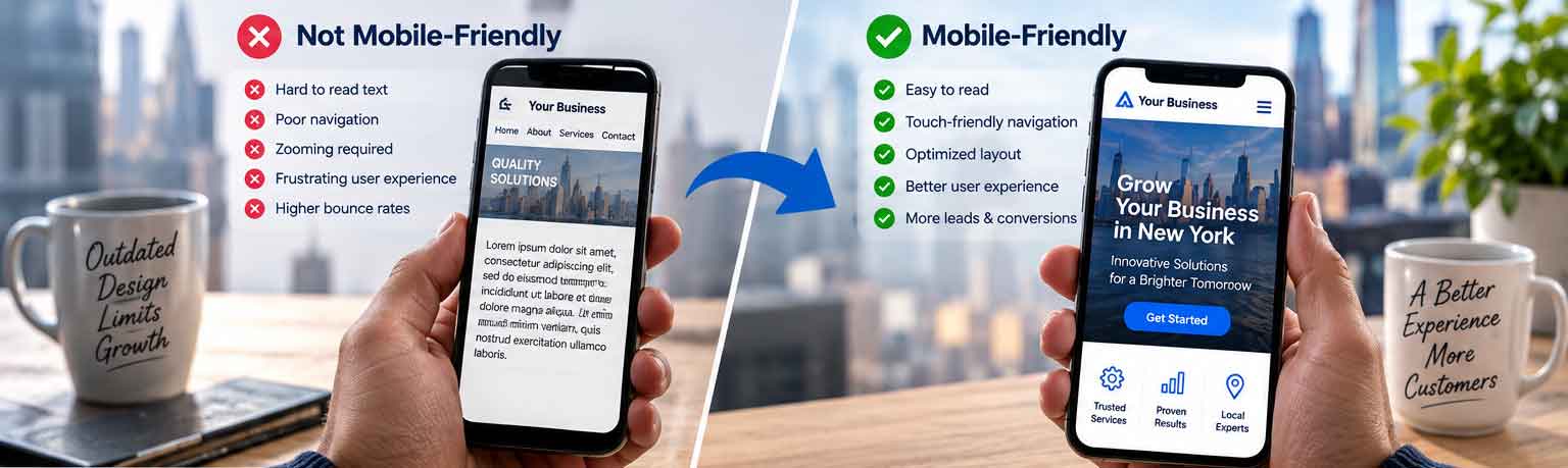
Images resize appropriately, columns can stack vertically, navigation becomes easier to use, text remains readable, and buttons are large enough to tap comfortably.
For example, a three-column service section that looks good on a desktop computer might become a single-column layout on a smartphone. A large desktop navigation menu may become a simple mobile menu. A contact form may be redesigned so customers can complete it easily using their phone.
Mobile-friendly websites are commonly built using responsive web design, allowing the layout and content to adapt to different screen sizes.
This is more than a visual adjustment. It is about creating a website experience that works naturally for the way people use mobile devices.
Google recommends responsive web design for new websites, and Google has adopted mobile-first indexing, meaning that Google primarily uses the mobile version of a website’s content for indexing and ranking.
For businesses investing in search engine optimization, mobile usability should therefore be considered from the beginning of the website development process.
Why Mobile Matters for New York Businesses
A customer searching for a plumber in Queens, a restaurant in Manhattan, a law firm in Brooklyn, or a professional service in the Bronx may discover your business from a smartphone. In these situations, the website often becomes the next step after a Google search or local listing.
People search for businesses while commuting, walking through the city, sitting in a café, shopping, working remotely, or simply comparing their options from their phones.
Imagine someone searching Google for a local service such as “New York web development company.” They find several businesses and open three or four websites on their smartphone.
The first website loads quickly and immediately explains the company’s services. The navigation is simple, the text is easy to read, and there is a prominent button to request a consultation.
The second website takes several seconds to load. The text is tiny, the navigation is difficult to use, and the visitor has to zoom in to read the content.
Even if both companies offer similar services, the first website creates a much better impression.
This is why mobile-friendly web design is not simply a technical requirement. It is part of the customer’s overall experience with your brand.
A person searching for “web development company New York” may discover several companies through Google. After reviewing the search results, the next step is often visiting the company’s website. If that website isn’t easy to navigate on a smartphone, the business can lose the opportunity before the visitor ever submits a form or makes a call.
Mobile-Friendly Web Design and SEO
Search engine optimization is one of the biggest reasons businesses should pay attention to mobile website performance.
Google’s mobile-first indexing means Google primarily uses the mobile version of a website when determining what content to index. Google also recommends that important content available on desktop remains available on mobile.
This does not mean that making a website responsive automatically guarantees higher Google rankings. SEO is much broader than mobile responsiveness.
Search engines also consider factors such as content relevance, website authority, technical SEO, page experience, internal linking, structured data, backlinks, and search intent.
However, if your website provides a poor experience on mobile devices, you are creating an unnecessary obstacle for both users and your overall SEO strategy.
A strong website should make it easy for search engines to understand your content and easy for visitors to consume it.
For companies researching website development in New York, mobile responsiveness should be considered a core requirement rather than an optional feature.
Mobile Users Expect Fast Websites
Responsive design is only one part of a successful mobile website.
Performance matters just as much.
A website can technically be mobile-friendly and still provide a poor experience if it takes too long to load.
Large images, unnecessary JavaScript, excessive plugins, inefficient CSS, third-party scripts, poor hosting, and unoptimized fonts can all contribute to slower page performance.
Google’s Core Web Vitals provide metrics for understanding important aspects of real-world page experience. These include Largest Contentful Paint (LCP), Interaction to Next Paint (INP), and Cumulative Layout Shift (CLS). Google currently recommends an LCP of 2.5 seconds or less, an INP below 200 milliseconds, and a CLS score of 0.1 or less.
For New York businesses, this matters because visitors often have many alternatives.
If your website takes too long to load, potential customers may simply go back to Google and choose another company.
A good mobile website therefore needs to be both responsive and fast.
Mobile Design Can Improve Lead Generation
The purpose of a business website is not just to provide information.
It should help move visitors toward becoming customers.
A potential customer might want to call your business, request a quote, schedule a consultation, make a booking, purchase a product, or send an inquiry.
These actions should be simple on a smartphone.
For example, a New York law firm may want a visitor to schedule a consultation. A home improvement company may want customers to request an estimate. A restaurant may want customers to make a reservation. A software company may want visitors to book a product demonstration.
The design should make these actions obvious without overwhelming the visitor.
A mobile-friendly website can place important calls to action in locations where users naturally expect them. Buttons can be designed for touch interaction, forms can be simplified, and important contact information can remain easy to find.
The result is a smoother path from website visitor to potential customer.
Your Website Is Often Your First Impression
For many customers, your website is their first interaction with your business.
Before contacting you, they may look at your homepage, services, portfolio, reviews, about page, and contact information.
A modern and professional mobile website can immediately communicate credibility.
An outdated website can do the opposite.
If the website looks broken on a smartphone, contains outdated information, or is difficult to navigate, visitors may question whether the business itself is reliable.
This is particularly important in New York, where customers have access to a huge number of businesses competing for their attention.
A professional website does not guarantee a sale, but a poor website can make it much easier for a potential customer to leave.
Mobile-Friendly Design Is Important for Local SEO
Mobile search and local business discovery are closely connected.
Someone searching for a nearby restaurant, dentist, contractor, lawyer, real estate agent, marketing company, or other service provider may discover a business through Google Search or Google Maps and immediately visit its website.
The visitor may want to know where the business is located, what services it provides, whether it is open, how much it costs, or how to contact the company.
A mobile-friendly website makes this process easier.
For a local New York business, the website should clearly communicate the areas it serves and provide useful business information. Depending on the company, this could include the physical address, phone number, service areas, opening hours, services, customer reviews, and directions.
This creates a better experience for visitors while supporting a broader local SEO strategy.
What Features Should a Small Business Website Have?
The right small business website features depend on the company’s goals.
A local service business may need a simple structure with service pages, testimonials, contact forms, click-to-call functionality, and location information.
An eCommerce company may need product search, shopping cart functionality, online payments, customer accounts, shipping options, and order management.
A professional services company may need detailed case studies, team profiles, appointment scheduling, downloadable resources, and lead-generation forms.
Regardless of the industry, responsive design should be considered a basic requirement.
The website should also make it easy for visitors to understand what the company does, why they should choose it, and what they should do next.
Good website design removes unnecessary friction.
Mobile-Friendly Website Checklist
A New York business website should:
- work properly across common smartphone screen sizes
- have readable text without zooming
- use easy-to-tap buttons
- have simple mobile navigation
- load important content quickly
- use optimized images
- provide mobile-friendly contact forms
- make phone numbers easy to tap
- avoid intrusive popups
- maintain consistent branding
- provide the same important content on mobile and desktop
- be tested using real devices as well as browser tools
WordPress vs Custom Website Development
One of the most common decisions businesses face when planning a new website is choosing between WordPress and custom development.
There is no universal answer.
WordPress is a powerful content management system and can be an excellent option for small businesses, professional services companies, publishers, and many eCommerce businesses.
A properly developed WordPress website can be responsive, fast, secure, SEO-friendly, and highly customizable.
For businesses that need a more specialized digital platform, custom website development may be a better choice.
Custom development provides greater control over functionality and can be useful when a company needs complex integrations, customer portals, advanced search, specialized workflows, custom dashboards, or other functionality that would be difficult to implement efficiently using standard WordPress plugins.
The decision between WordPress and custom development should therefore be based on business requirements rather than simply choosing the technology that appears cheaper.
Businesses comparing WordPress with custom development should also consider functionality, scalability, maintenance, and overall website development costs in New York.
Custom Web Development vs Website Builder
Businesses also frequently compare custom web development with website builders.
Website builders can be useful for individuals and small businesses that need a simple website quickly. They often provide templates and drag-and-drop tools that make basic website creation relatively straightforward.
However, businesses can eventually reach the limits of a website builder when they need more advanced functionality.
A growing New York business may eventually require CRM integrations, payment systems, booking systems, customer dashboards, APIs, advanced search, membership functionality, or custom automation.
In such cases, custom development can provide greater flexibility and scalability.
The right choice depends on where your business is today and where you expect it to be in the future.
How Much Does Website Development Cost in New York?
The website development costs for New York businesses businesses should expect can vary significantly.
There is no fixed price because every website project has different requirements.
A small brochure-style website with a few pages will naturally require less development than a large eCommerce website or custom web application.
The final cost can depend on the number of pages, design requirements, content, functionality, integrations, CMS, eCommerce features, SEO requirements, hosting, security, and ongoing maintenance.
The same applies to WordPress website cost New York.
A basic WordPress website using an existing theme can have a very different budget from a completely customized WordPress website with bespoke functionality and integrations.
Instead of focusing only on the initial development price, businesses should consider the long-term value of the website.
A website that costs less but generates very few leads may not provide good value. A professionally developed website that attracts qualified visitors and converts them into customers can deliver substantially greater value over time.
How Long Does Website Development Take?
The website development timeline depends on the project’s scope and complexity.
A relatively simple business website may be completed within a few weeks, while a larger website can require several months.
The development process usually involves several stages, including discovery, planning, design, development, content implementation, SEO, integrations, testing, performance optimization, and launch.
One of the most common causes of delays is not development itself but changes to project requirements, delays in content delivery, design revisions, or waiting for third-party integrations.
For this reason, businesses should establish a clear scope before development begins.
A well-planned project usually has a smoother development process and a more predictable timeline.
Responsive Design Should Start During the Planning Stage
Responsive web design should start during the planning stage, rather than being treated as an adjustment after the desktop website has already been completed.
A better approach is to consider mobile users from the beginning.
During the planning stage, designers and developers should consider how the navigation, page layouts, content hierarchy, forms, images, buttons, and calls to action will work on smaller screens.
This is often referred to as a responsive or mobile-first approach.
The goal isn’t to create a separate “mobile version” of the website.
Instead, the website should be designed as a flexible experience that works across different screen sizes.
Google recommends responsive web design because a single website can serve users across devices while maintaining consistent content and URLs.
Mobile-Friendly Does Not Mean “Just Make Everything Smaller”
A common misunderstanding is that mobile-friendly design simply means reducing the size of a desktop website.
In reality, mobile users interact with websites differently.
A desktop navigation bar containing ten menu items may need to become a compact mobile menu.
A wide comparison table may need to become a scrollable or reorganized component.
A large hero section may need different spacing and typography.
A multi-field form may need to be simplified.
Images may need different dimensions and resolutions.
Buttons need sufficient space for touch interaction.
The entire layout should be considered from the perspective of someone using a smaller screen.
This is why professional responsive design requires more than simply adding a CSS media query.
Accessibility and Mobile Usability
Mobile-friendly design also overlaps with accessibility.
Readable text, sufficient spacing, clear navigation, descriptive links, accessible forms, appropriate contrast, and logical content structure can benefit both mobile users and people with disabilities.
Accessibility should not be treated as an afterthought.
When a website is easier to understand and navigate, more people can use it successfully.
This can improve the overall customer experience while helping businesses create a more inclusive digital presence.
How to Choose a Web Development Company in New York
When evaluating companies offering website development in New York, look beyond visual design and compare their approach to responsive development, performance, SEO, security, and ongoing maintenance.
Choosing the right web development company New York businesses can work with is an important decision.
Price should not be the only consideration.
Look at the company’s previous projects and determine whether they have experience building websites similar to yours.
Ask how they approach responsive design, SEO, performance optimization, security, integrations, testing, and ongoing maintenance.
It is also important to understand exactly what is included in the proposal.
For example, does the project include responsive development? Is SEO included? Who provides the content? Is website hosting included? Are third-party integrations included? How many rounds of revisions are allowed? What happens after launch?
Clear answers to these questions can prevent misunderstandings later.
For businesses looking for professional website development services in the USA, E Pixel Services’ website development agency provides website design and development solutions for businesses and organizations.
How to Make an Existing Website More Mobile-Friendly
You don’t always need to replace your existing website.
In some cases, targeted improvements can significantly improve the mobile experience.
Start by opening your website on several smartphones and tablets.
Look at how quickly the homepage loads. Check whether the navigation works correctly. Try completing your contact form. Tap every important button. Read your service pages without zooming. Check whether images fit within the screen.
Pay particular attention to pages that generate the most traffic.
Google Search Console and PageSpeed Insights can also help identify technical and performance issues.
If your website has a high amount of unused CSS or JavaScript, oversized images, slow server response times, layout shifts, or poorly optimized third-party scripts, addressing these problems can improve the overall experience.
It is usually better to prioritize the problems that have the greatest impact rather than attempting to optimize everything simultaneously.
If your existing website does not provide a good mobile-friendly experience, targeted improvements can often make a significant difference without requiring a complete redesign.
The Connection Between Mobile Design, Speed, SEO, and Conversions
The strongest websites don’t treat design, SEO, performance, and conversion optimization as completely separate activities.
They work together.
Consider a customer searching Google for a service in New York.
They discover your business, click your result, and arrive on your website.
If the page loads quickly, the content immediately answers their question, the layout is easy to navigate, and the call to action is clear, the visitor has a much easier path toward becoming a lead.
Now imagine the opposite.
The page loads slowly. The text is difficult to read. The navigation doesn’t work properly. The visitor can’t find your phone number. The contact form is difficult to complete.
Even if your business provides excellent services, the website may prevent the customer from taking the next step.
That is why mobile-friendly web design should be considered part of your overall digital marketing strategy.
Why New York Businesses Should Invest in Mobile-Friendly Web Design
New York is not an easy market.
Customers have countless choices, and businesses are competing not only with companies in their immediate neighborhood but also with businesses across the city, state, country, and sometimes the world.
A website needs to communicate value quickly.
Mobile-friendly web design helps businesses meet modern customer expectations by providing a website that is accessible, responsive, fast, and easy to navigate.
It can support SEO, improve user experience, strengthen brand credibility, simplify lead generation, and make it easier for customers to contact or purchase from a business.
Whether you are launching a new website or improving an existing one, mobile should not be treated as an optional feature.
It should be part of the foundation.
Final Thoughts
The way people interact with businesses online has changed.
Customers don’t wait until they are sitting in front of a desktop computer to research a company. They search from their phones, compare businesses, read reviews, visit websites, and make decisions wherever they happen to be.
For New York businesses, this makes mobile-friendly web design more important than ever.
The best website isn’t necessarily the one with the most animations, the most features, or the highest development budget.
It is the website that makes it easy for the right customers to find the business, understand its value, trust the company, and take the next step.
Whether you choose WordPress, custom development, or another technology, prioritize responsive design, performance, accessibility, useful content, strong calls to action, and a clear customer journey.
If your current website wasn’t designed with mobile users in mind, now is the right time to evaluate it.
Your customers are already searching from their phones.
Your website needs to be ready when they arrive.
also Choosing a web development partner is about more than finding someone who can build a website. Businesses should look for a development team that understands responsive design, technical SEO, website performance, security, integrations, and long-term maintenance.
E Pixel Services works with businesses on website design and development projects ranging from WordPress websites and responsive business websites to custom web development and eCommerce solutions. This broader technical approach helps businesses build websites that are designed not only to look professional but also to support long-term growth.
Frequently Asked Questions
What is mobile-friendly web design?
Mobile-friendly web design is the process of creating a website that works effectively across smartphones, tablets, laptops, and desktop computers. The layout, text, images, navigation, forms, and interactive elements adapt to different screen sizes so visitors can use the website comfortably on any device.
Why is mobile-friendly web design important for New York businesses?
Mobile-friendly web design helps New York businesses provide a better experience for customers who search for products and services using smartphones. A responsive website can make it easier for visitors to navigate, find information, contact a business, and complete important actions such as requesting a quote or making a purchase.
Does mobile-friendly web design affect SEO?
Mobile usability is an important part of a modern SEO strategy. Google uses the mobile version of websites for mobile-first indexing, while other factors such as content quality, relevance, technical SEO, page experience, links, and search intent also influence search visibility.
How much does website development cost in New York?
Website development costs in New York vary depending on the project’s size, design, functionality, technology, integrations, eCommerce requirements, SEO, content, and ongoing maintenance. A simple business website generally requires less development work than a large eCommerce platform or custom web application.
For a detailed breakdown, read our guide on How Much Does Website Development Cost in New York in 2026?
Is WordPress better than custom website development?
Neither option is universally better. WordPress can be an effective solution for many small businesses and professional service companies, while custom website development may be more suitable for businesses that require specialized functionality, complex integrations, custom workflows, or advanced applications.
How long does website development take?
The website development timeline depends on the project’s scope, number of pages, design requirements, content, functionality, integrations, testing, and revisions. A simple business website may take a few weeks, while a larger WordPress, eCommerce, or custom development project can take several months.
What features should a small business website have?
Important small business website features can include responsive design, clear navigation, service pages, contact forms, click-to-call functionality, testimonials, calls to action, analytics, security, SEO-friendly content, and fast-loading pages.
What is the difference between custom web development and a website builder?
Website builders typically provide templates and pre-built tools for creating websites quickly. Custom web development provides greater flexibility and control and can be a better option when a business needs specialized functionality, custom integrations, advanced workflows, or a highly tailored user experience.
How can I make my existing website more mobile-friendly?
Start by checking your website on different smartphones and tablets. Look for difficult navigation, small text, oversized images, slow-loading pages, broken layouts, difficult forms, and buttons that are hard to tap. Performance tools such as Google PageSpeed Insights and Google Search Console can also help identify areas for improvement.
Read More and Useful Resources
For additional information about mobile-first indexing, responsive design, and website performance, Google’s official resources are useful references:
Google Search Central – Mobile-First Indexing
https://developers.google.com/search/blog/2023/10/mobile-first-is-here
Google Search Central – Mobile Sites and Mobile-First Indexing
https://developers.google.com/search/docs/crawling-indexing/mobile/mobile-sites-mobile-first-indexing
Google Search Central – Core Web Vitals
https://developers.google.com/search/docs/appearance/core-web-vitals
Google Page Experience
https://developers.google.com/search/docs/appearance/page-experience
If you’re planning a new website, understanding the expected investment is equally important. Our guide to website development costs in New York in 2026 explains pricing factors, project types, WordPress and custom development costs, and typical development timelines.
Need our services: Request a Quote